The first place on campus that I located was just outside of Ohio Hall. The entrance of Ohio Hall is ADA approved, as of last year, because of the installation of a ramp. The ramp provides students who use wheelchairs, with accessibility to their dorm. This is somewhat compliant with ADA because it is wider than 36" and has a 4" minimum barrier edge, but it does not include a handrail and the landing is not 60" wide.
The second place I located was the seating and meeting area outside of Jerry's Cafe. This space is somewhat inclusive. There are many different options for sitting, such as arm chairs, high stools with no back and a place to work, and also stools with a back and a smaller workspace. There is more than a 44" space to walk behind the chairs at the bar, even when 18" is given for the chair to be scooted back. However, I don't see inclusive design in the area provided for conversation and resting in arm chairs. The chairs are too close together to provide space for two people to talk and feel comfortable. If you go further down the corridor, there is not enough space between the last chair and the wall for people to walk. There is surely not 44", which means that two people could not comfortable pass, especially if someone was sitting in the furthest chair. I do not think this design was inclusive, as the users were not considered when these chairs were placed and the locations of the doors were decided. A wheelchair could definitely not fit comfortably in this corridor. Flexibility is also an principle of Inclusive Design. The walking route was not considered in this design.
I would suggest that in the case of Jerry's Cafe, they install booth seating along the wall, with tables to work at. This provides the comfort of the chairs, while also encouraging this as a study space.
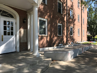 Ramp entrance outside of Ohio Hall
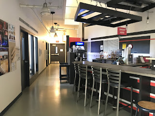 The bar at Jerry's Cafe
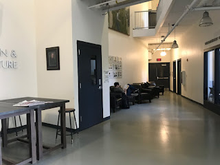 Sitting and studying area outside of Jerry's Cafe
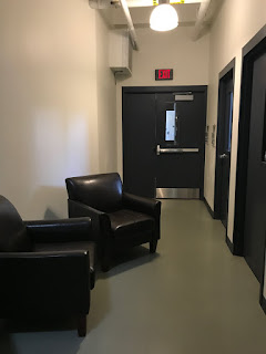 The space between the chairs and the doors are awkward and not inclusively designed
Comments
Post a Comment